Chez Kuk
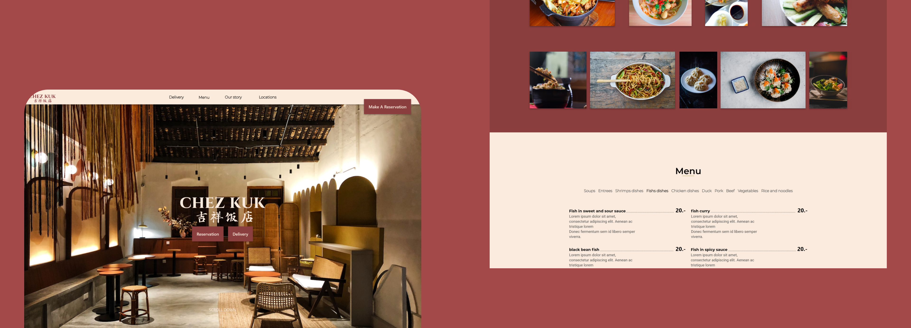
Responsive Design
Project Overview
Kuk Restaurant specializes in Chinese cuisine and is located in Plainpalais, Geneva, near fast food brands. Their goal is to serve high-quality traditional Chinese food from their region, targeting workers and students during the day and families during the night.
During this research project, I drafted two research proposals that included both secondary and primary research to better understand Kuk Restaurant’s Chinese cuisine target audience, identify the target demographic behavior, the user journey when booking a table at the restaurant, and ultimately understand the successes and failures of competitors. Additionally, I conducted interviews with participants about their experience with the online booking process I designed for Kuk Restaurant’s website in order to improve the scheduling process and the final product’s design.
Timeline
1 Month
Tools
Adobe XD
Miro
Figma
Responsabilities
Ux Research
Visual Design
Wireframing
Prototype
Usability testing
Problem Statement
The design of the existing site appears outdated, lacks user-friendliness, photos, and important information. Also, the current site is not optimized for mobile devices, and customers become frustrated when they cannot make reservations by calling outside of the restaurant’s business hours. As a result, the goal of the project was to create a modern design that would attract potential customers.
Competitive Analysis
As this was one of my first-ever projects, the competition analysis was incredibly helpful in understanding the existing products in the market and identifying trends, gaps, and opportunities to improve the responsive web design for Chez Kuk Restaurant.
For this project, I decided to analyzed 4 local companies in Geneva, Switzerland that are:


Some gaps we identified include:
- Both BaoCanteen and Akiko do not showcase their food with nice photography of their menus.
- BaoCanteen, Akiko, and Feuille de Banane do not offer multiple language options on their websites.
Some opportunities we identified include:
- Expanding language options to make the website accessible to people of different cultures.
User Pain Points


« Busy workers can’t book a table when the restaurant is closed. »
« You can’t either book a table on Kuk’s restaurant website. »
Digital Wireframe
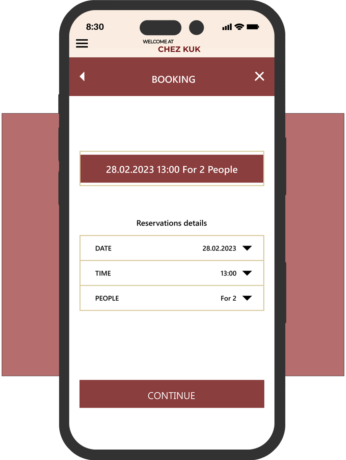
It was time to sketch the first wireframe on paper, as one of the main problems with the website was the online booking process. I practiced my Crazy Eights skills and after a few iterations, I started creating my digital wireframes.
Below are some of the digital wireframes.
Testing The Online Booking Process & Usability Study
I conducted two usability studies, one for the low-fidelity prototype and one for the high-fidelity prototype. The findings from the low-fidelity prototype study helped me understand the user flow, while the high-fidelity prototype study helped me refine the visual design.
Round findings 1:
Users want a simpler way to select the booking time.
Users want a special request option for seat positions, allergies, babies, and events.
Users want better guidance or a more descriptive label for the final « SUBMIT » button to feel confident in completing their booking process.
Round Findings 2:
Use a different color for the call to action button.
Use icons to help make navigation easier.
Solution
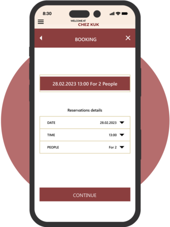
High-Fidelity Prototype
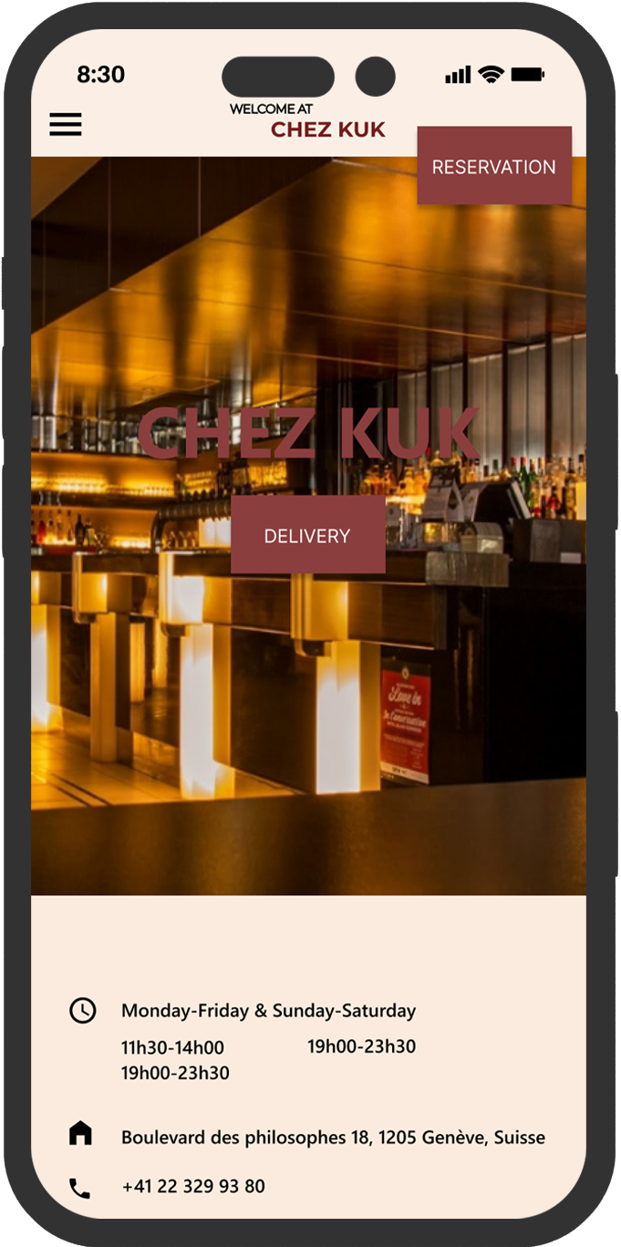
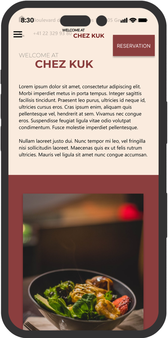
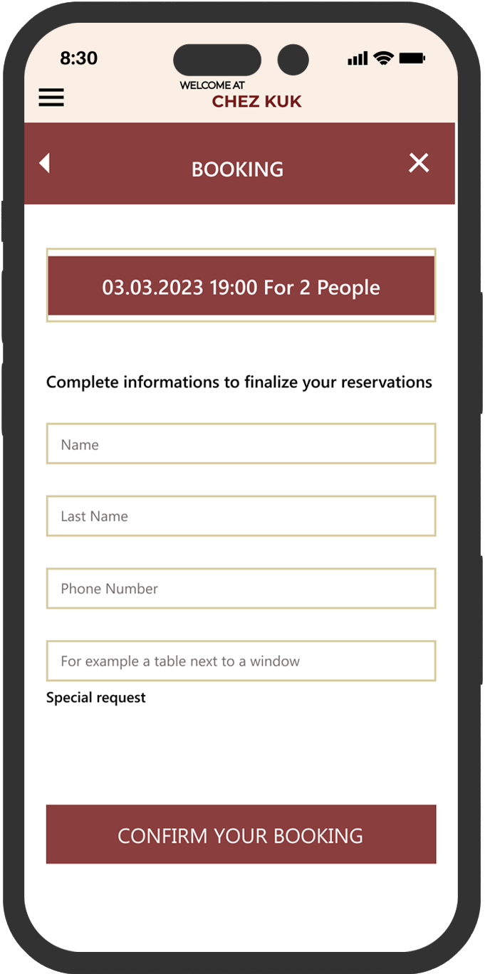
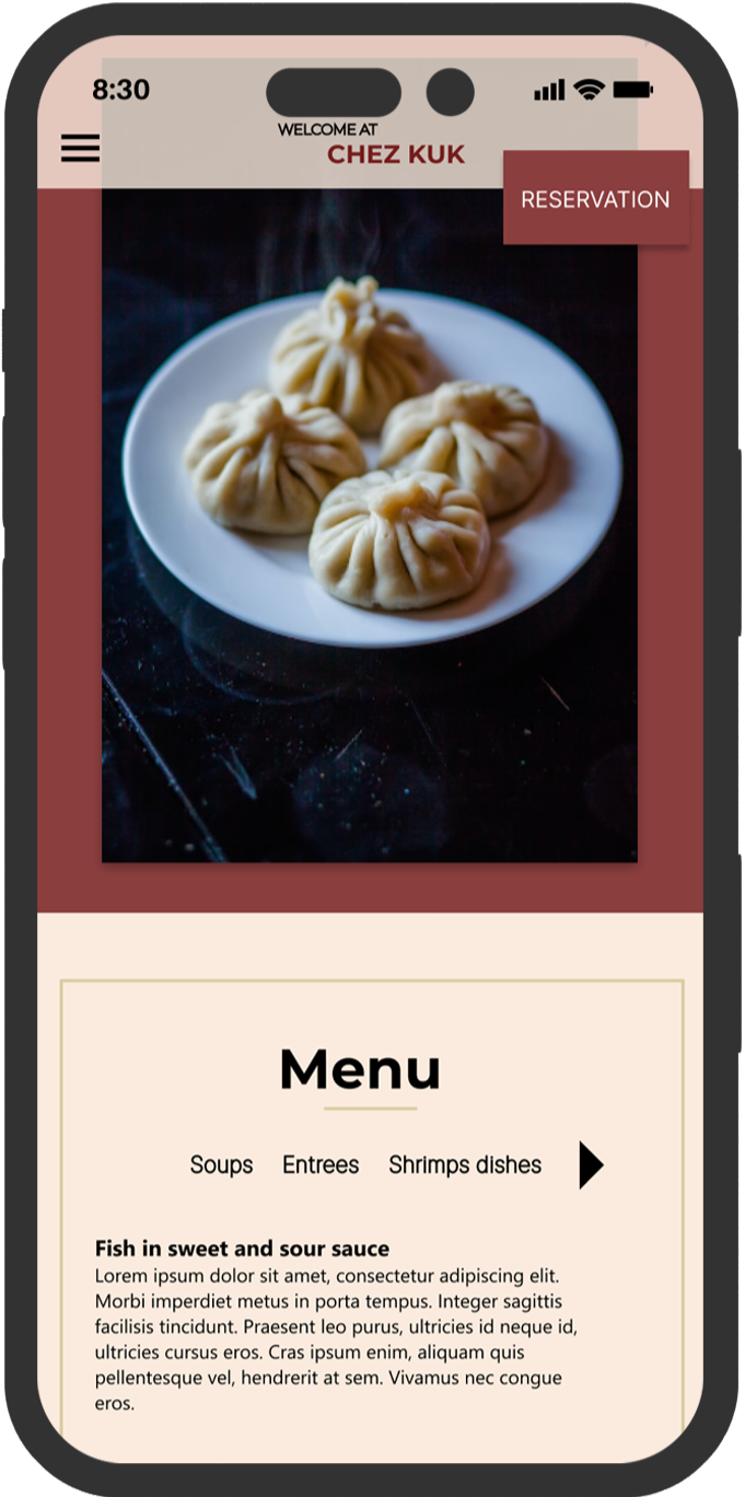
Responsive Design
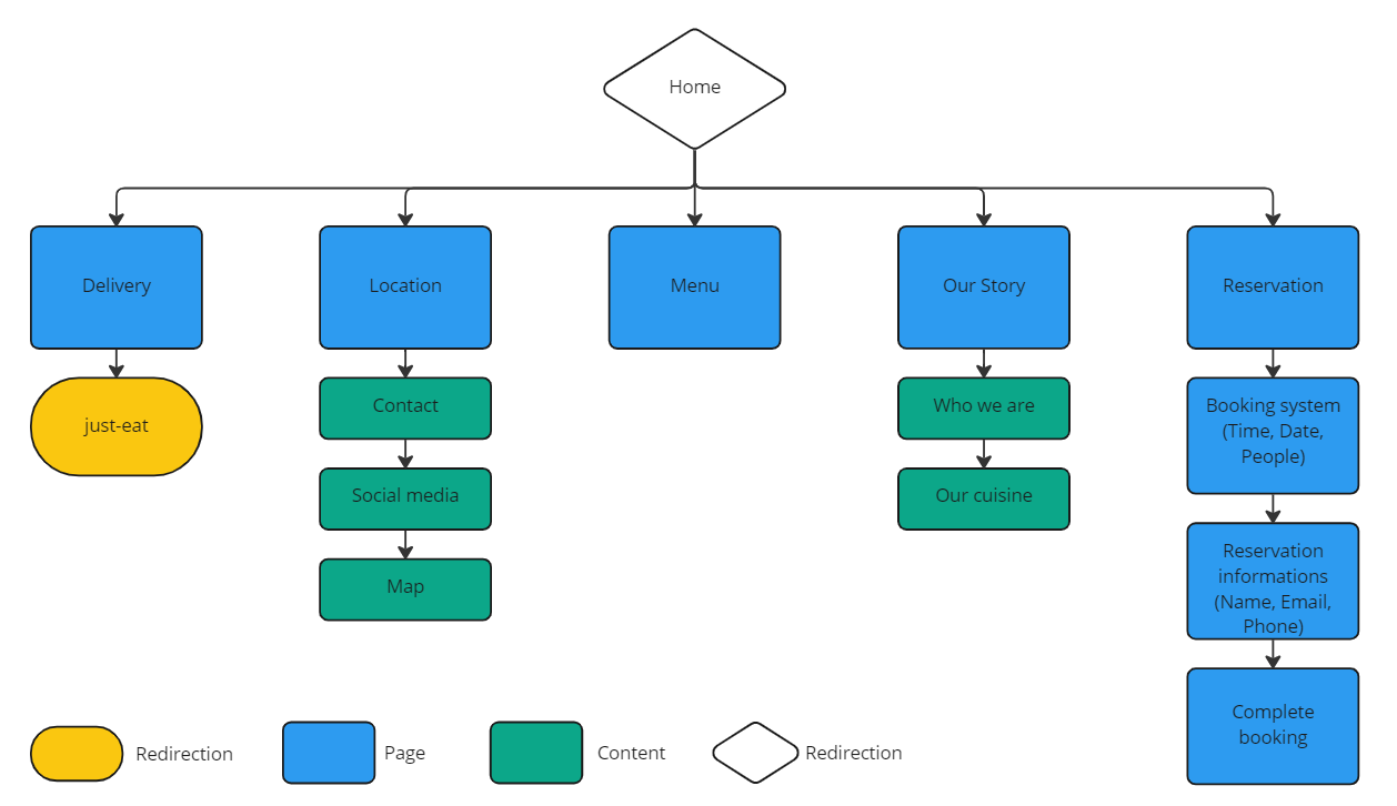
Before beginning the website design, I created a sitemap that included all of the existing features in the app. I chose a hierarchical website style that worked well for me. The design for screen size variations included versions for both desktop and phone. I optimized and adapted the design for different screen sizes.
Conclusion & What I Learned
The online booking process of Kuk’s Restaurant website meets the users’ needs. According to the information gathered during the interview, 80% of the users agreed that they will use it, while 20% neither agreed nor disagreed.
For my first UX Design project, I created paper wireframes, digital wireframes, low-fidelity, and high-fidelity prototypes. I also conducted an interview and a usability study and iterated on the design based on the feedback received. I learned that usability studies are crucial, and the feedback from the interviewees was valuable in improving my design.
What would I’d do differently?
For the next steps, I would conduct another usability study after the product launch to get feedback on the final product in the real world.
Thank you for your time reviewing my work on Chez Kuk Responsive Design!

